SmartMenus for  Documentation
Quick setup
Include the CSS files on your page (preferably in the HEAD section):
<!-- SmartMenus core CSS (required) -->
<link href='sm-core-css.css' rel='stylesheet' type='text/css' />

<!-- "sm-blue" menu theme (optional, you can use your own CSS, too) -->
<link href='sm-blue/sm-blue.css' rel='stylesheet' type='text/css' />
Include the JS files on your page (preferably after your page content right before the closing </body> tag):
<!-- jQuery -->
<script src="jquery.js" type="text/javascript"></script>

<!-- SmartMenus jQuery plugin -->
<script src="jquery.smartmenus.js" type="text/javascript"></script>
The menu definition is a standard unordered list structure:
<ul id="main-menu" class="sm sm-blue">
  <li><a href="#">Item 1</a></li>
  <li><a href="#">Item 2</a>
    <ul>
      <li><a href="#">Item 2-1</a></li>
      <li><a href="#">Item 2-2</a></li>
      <li><a href="#">Item 2-3</a></li>
    </ul>
  </li>
  <li><a href="#">Item 3</a></li>
</ul>
You always need to set the sm class and, optionally, if you would like to use some of the default themes, set its class too (e.g. sm-blue in the example above).
If you would like to have a vertical main menu instead of horizontal, you also need to set the sm-vertical class:
<ul id="main-menu" class="sm sm-vertical sm-blue"> ...
The script is initialized like any other jQuery plugin:
$(function() {
  $('#main-menu').smartmenus();
});
Options
- bootstrapHighlightClasses
-
Type: StringSupported with: Bootstrap 4 addonDefault value:
'text-dark bg-light'CSS class(es) for highlighting expanded parent dropdown items. - bottomToTopSubMenus
-
Type: BooleanDefault value:
falseDetermines whether the sub menus should be displayed from bottom to top (drop-up) instead of top to bottom (drop-down). - collapsibleBehavior
-
Type: StringDefault value:
'default'Parent items behavior in collapsible (mobile) view.Possible values:'default'- first tap on parent item expands sub, second tap loads its link.'toggle'- the whole parent item acts just as a toggle button for its sub menu (expands/collapses on each tap).'link'- the parent item acts as a regular item (first tap loads its link), the sub menu can be expanded only via the +/- button.'accordion'- like'default'but on expand also resets any visible sub menus from deeper levels or other branches.'accordion-toggle'- like'toggle'but on expand also resets any visible sub menus from deeper levels or other branches.'accordion-link'- like'link'but on expand also resets any visible sub menus from deeper levels or other branches. - collapsibleHideDuration
-
Type: IntegerDefault value:
0The duration for hide animation for collapsible sub menus. This option matters only ifcollapsibleHideFunction: null - collapsibleHideFunction
-
Type: null, FunctionDefault value:
function($ul, complete) { $ul.slideUp(200, complete); }Custom function to use when hiding a collapsible sub menu (the default is the jQuery 'hide').Code sample:collapsibleHideFunction: function($ul, complete) { $ul.slideUp(250, complete); }Note: Don't forget to call complete() at the end of whatever you do with the$ul(the sub menu). - collapsibleShowDuration
-
Type: IntegerDefault value:
0The duration for show animation for collapsible sub menus. This option matters only ifcollapsibleShowFunction: null - collapsibleShowFunction
-
Type: null, FunctionDefault value:
function($ul, complete) { $ul.slideDown(200, complete); }Custom function to use when showing a collapsible sub menu (the default is the jQuery 'show').Code sample:collapsibleShowFunction: function($ul, complete) { $ul.slideDown(250, complete); }Note: Don't forget to call complete() at the end of whatever you do with the$ul(the sub menu). - hideDuration
-
Type: IntegerDefault value:
0The duration in milliseconds for hide animation. Set it to 0 for no animation. This option matters only ifhideFunction: null - hideFunction
-
Type: null, FunctionDefault value:
function($ul, complete) { $ul.fadeOut(200, complete); }Custom function to use when hiding a sub menu (the default is the jQuery 'hide').Code sample:hideFunction: function($ul, complete) { $ul.fadeOut(250, complete); }Note: Don't forget to call complete() at the end of whatever you do with the$ul(the sub menu). - hideOnClick
-
Type: BooleanDefault value:
trueDetermines whether to hide (reset) the sub menus on click/tap anywhere on the page. - hideTimeout
-
Type: IntegerDefault value:
500The timeout in milliseconds before hiding (resetting) the sub menus on mouseout/focusout. - isPopup
-
Type: BooleanDefault value:
falseDetermines whether the menu is a popup menu or a permanent menu bar. Popup menus can be shown/hidden via thepopupShowandpopupHideAPI methods. Make sure you position offscreen or hide withdisplay:nonein your CSS any popup menus you have. - keepHighlighted
-
Type: BooleanDefault value:
trueDetermines whether all ancestor items of the current sub menu should be kept highlighted - the script adds thehighlightedclass to the links (the<a>elements). - keepInViewport
-
Type: BooleanDefault value:
trueDetermines whether the sub menus should be repositioned if needed to make sure they always appear inside the viewport. - mainMenuSubOffsetX
-
Type: IntegerDefault value:
0Allows setting a horizontal offset in pixels from the default position for the first-level sub menus. You may want to check thesubMenusSubOffsetXoption, too. - mainMenuSubOffsetY
-
Type: IntegerDefault value:
0Allows setting a vertical offset in pixels from the default position for the first-level sub menus. You may want to check thesubMenusSubOffsetYoption, too. - markCurrentItem
-
Type: BooleanDefault value:
falseDetermines whether the script should automatically add thecurrentclass to the<a>element of the item linking to the current page URL. - markCurrentTree
-
Type: BooleanDefault value:
trueDetermines whether the script should automatically add thecurrentclass to the<a>elements of all ancestor items of the current item. This option matters only ifmarkCurrentItem: true - noMouseOver
-
Type: BooleanDefault value:
falseDetermines whether onmouseover item/sub menus activation should be disabled (i.e. make it possible to always behave like in touch mode and use just mouse clicks). - overlapControlsInIE (deprecated) (removed in v1.1.0)
-
Type: BooleanDefault value:
trueDetermines whether the script should make sure the sub menus appear on top of special OS controls in Internet Explorer (i.e. SELECT, OBJECT, EMBED, etc.) You may opt to disable this feature if you don't need this fix and would like to achieve best possible runtime performance in IE (other browsers are not affected anyway). - rightToLeftSubMenus
-
Type: BooleanDefault value:
falseDetermines whether the sub menus should be displayed from right to left instead of left to right. You may need to check and update the CSS for the sub indicators' position, too (i.e. look forspan.sub-arrow). - scrollAccelerate
-
Type: BooleanDefault value:
trueDetermines whether to accelerate scrolling or use a fixed step for long sub menus that do not fully fit in the viewport height (i.e. start slower and then gradually increase the step). - scrollStep
-
Type: IntegerDefault value:
30Step in pixels when scrolling long sub menus that do not fit in the viewport height. - showDuration
-
Type: IntegerDefault value:
0The duration in milliseconds for show animation. Set it to 0 for no animation. This option matters only ifshowFunction: null - showFunction
-
Type: null, FunctionDefault value:
nullCustom function to use when showing a sub menu (the default is the jQuery 'show').Code sample:showFunction: function($ul, complete) { $ul.fadeIn(250, complete); }Note: Don't forget to call complete() at the end of whatever you do with the$ul(the sub menu). - showOnClick
-
Type: BooleanDefault value:
falseDetermines whether to show the first-level sub menus onclick instead of onmouseover - i.e. like drop-down menus on desktop applications. This option matters only for mouse input. - showTimeout
-
Type: IntegerDefault value:
250The timeout in milliseconds before showing the sub menus on mouseover/focusin. - subIndicators
-
Type: BooleanDefault value:
trueDetermines whether to create sub menu indicators. The script creates a<span>and inserts it in the item's<a>element. - subIndicatorsPos
-
Type: StringDefault value:
'append'Position of the sub menu indicator<span>relative to the menu item content. A keyword specifying the jQuery method to use when inserting the<span>in the menu item's<a>element.Possible values:'prepend'- insert it before the item's content.'append'- insert it after the item's content. - subIndicatorsText
-
Type: StringDefault value:
''A text string to be added in the sub menu indicator<span>(e.g. '+'). You may need to check and update the CSS for the sub indicators, too (i.e. look for span.sub-arrow). - subMenusMaxWidth
-
Type: StringDefault value:
'20em'Max-width for the sub menus in any valid CSS unit. If a value is set, any fixed width set in CSS will be ignored by the script. - subMenusMinWidth
-
Type: StringDefault value:
'10em'Min-width for the sub menus in any valid CSS unit. If a value is set, any fixed width set in CSS will be ignored by the script. - subMenusSubOffsetX
-
Type: IntegerDefault value:
0Allows setting a horizontal offset in pixels from the default position for the second+ level sub menus. You may want to check themainMenuSubOffsetXoption, too. - subMenusSubOffsetY
-
Type: IntegerDefault value:
0Allows setting a vertical offset in pixels from the default position for the second+ level sub menus. You may want to check themainMenuSubOffsetYoption, too.
data-* attribute options
- data-sm-horizontal-sub
-
Set to:
<li>elements that have a sub menu (i.e. sub<ul>element)Allows creating horizontal sub menus (additional CSS required for styling the sub menus).Code sample:HTML:<li data-sm-horizontal-sub="true"><a href="#">Item</a> <ul> <li><a href="#">Sub item 1</a></li> <li><a href="#">Sub item 2</a></li> </ul> </li>CSS:@media (min-width: 768px) { /* horizontal sub menus */ li[data-sm-horizontal-sub] { position: static; } li[data-sm-horizontal-sub] > ul { left: 0 !important; right: 0 !important; margin-left: 0 !important; margin-top: 0 !important; width: auto !important; min-width: 0 !important; max-width: none !important; } li[data-sm-horizontal-sub] > ul > li { float: left; } li[data-sm-horizontal-sub] > .scroll-up, li[data-sm-horizontal-sub] > .scroll-down { display: none !important; } /* if you like, add more rules to tweak the look of horizontal sub menus... */ } - data-sm-options
-
Set to: the root
<ul>elementAllows setting any options directly in the HTML source. These have highest priority and will extend and override any options passed to the init function call in your JS code.
Note: Value must be in valid JSON format. Please note that setting the following options is not supported for security reasons and if you try to set them, they will be ignored:showFunction,hideFunction,collapsibleShowFunction,collapsibleHideFunction.Code sample:<ul id="main-menu" class="sm sm-blue" data-sm-options='{ "showTimeout": 150, "subIndicators": false, "subMenusMinWidth": "250px" }'>... - data-sm-reverse
-
Set to:
<li>elements that have a sub menu (i.e. sub<ul>element)Allows reversing the horizontal alignment of a specific sub menu. Reverses the direction regardless of the value of therightToLeftSubMenusoption. A common use case is when we want all sub menus of a horizontal main menu to be left aligned except the last one that we would like to be right aligned.Code sample:<li data-sm-reverse="true"><a href="#">Item</a> <ul> <li><a href="#">Sub item 1</a></li> <li><a href="#">Sub item 2</a></li> </ul> </li> - data-sm-skip
-
Supported with: Bootstrap addon; Bootstrap 4 addonSet to: any Bootstrap navbar's
ul.navbar-navelementTells the script to skip this navbar and not apply any SmartMenus features to it so it will behave like a regular Bootstrap navbar.Code sample:<ul class="nav navbar-nav" data-sm-skip="true">...
- data-sm-skip-collapsible-behavior
-
Supported with: Bootstrap addon; Bootstrap 4 addonSet to: any Bootstrap navbar's
ul.navbar-navelementTells the script to not apply SmartMenus' specific behavior to this navbar in collapsible mode (mobile view). Bootstrap's behavior for navbars in collapsible mode is to use the whole area of the parent items just as a toggle button for their sub menus and thus it's impossible to set a link to the parent items that can be followed on click/tap. SmartMenus' behavior is to add a separate dedicated +/- sub menus toggle button to parent items and thus allows the link of the parent items to be activated on the second click/tap (the first click/tap displays the sub menu if it's not visible).Code sample:<ul class="nav navbar-nav" data-sm-skip-collapsible-behavior="true">...
Events
- activate
-
Fired when an item is activated, right before its sub menu (if the item has a sub menu) is shown. You can cancel the event with
return falseand the item's sub menu will not be shown.Cancelable: YesArguments:- e
- The jQuery.Event object.
- item
- The menu item
<a>element.
Code sample:$('#main-menu').on('activate.smapi', function(e, item) {}); - beforefirstshow
-
Fired only once for each sub menu, right before it's shown for the first time. You could use it, for example, for some initialization tasks that need to be called just once. You can cancel the event with
return falseand the sub menu will not be shown.Cancelable: YesArguments:- e
- The jQuery.Event object.
- menu
- The sub menu
<ul>element.
Code sample:$('#main-menu').on('beforefirstshow.smapi', function(e, menu) {}); - beforehide
-
Fired right before a sub menu is hidden. You can cancel the event with
return falseand the sub menu will not be hidden.Cancelable: YesArguments:- e
- The jQuery.Event object.
- menu
- The sub menu
<ul>element.
Code sample:$('#main-menu').on('beforehide.smapi', function(e, menu) {}); - beforeshow
-
Fired right before a sub menu is shown. You can cancel the event with
return falseand the sub menu will not be shown.Cancelable: YesArguments:- e
- The jQuery.Event object.
- menu
- The sub menu
<ul>element.
Code sample:$('#main-menu').on('beforeshow.smapi', function(e, menu) {}); - blur
-
Fired when an item loses focus.Cancelable: NoArguments:
- e
- The jQuery.Event object.
- item
- The menu item
<a>element.
Code sample:$('#main-menu').on('blur.smapi', function(e, item) { // check namespace if you need to differentiate from a regular DOM event fired inside the menu tree if (e.namespace == 'smapi') { // your handler code } }); - click
-
Fired when an item is clicked. You can cancel the event with
return falseand the item will not be selected (i.e. its link won't be loaded) and if there is a sub menu which should appear on click, it won't be shown, too. This event is fired even for disabled items so you may want to check theselectevent, too.Cancelable: YesArguments:- e
- The jQuery.Event object.
- item
- The menu item
<a>element.
Code sample:$('#main-menu').on('click.smapi', function(e, item) { // check namespace if you need to differentiate from a regular DOM event fired inside the menu tree if (e.namespace == 'smapi') { // your handler code } }); - focus
-
Fired when an item is focused.Cancelable: NoArguments:
- e
- The jQuery.Event object.
- item
- The menu item
<a>element.
Code sample:$('#main-menu').on('focus.smapi', function(e, item) { // check namespace if you need to differentiate from a regular DOM event fired inside the menu tree if (e.namespace == 'smapi') { // your handler code } }); - hide
-
Fired right after a sub menu is hidden.Cancelable: NoArguments:
- e
- The jQuery.Event object.
- menu
- The sub menu
<ul>element.
Code sample:$('#main-menu').on('hide.smapi', function(e, menu) {}); - hideAll
-
Fired when the whole menu tree is reset (e.g. on document click, onmouseout).Cancelable: NoArguments:
- e
- The jQuery.Event object.
Code sample:$('#main-menu').on('hideAll.smapi', function(e) {}); - mouseenter
-
Fired when an item is hovered.Cancelable: NoArguments:
- e
- The jQuery.Event object.
- item
- The menu item
<a>element.
Code sample:$('#main-menu').on('mouseenter.smapi', function(e, item) { // check namespace if you need to differentiate from a regular DOM event fired inside the menu tree if (e.namespace == 'smapi') { // your handler code } }); - mouseleave
-
Fired when an item is hovered out.Cancelable: NoArguments:
- e
- The jQuery.Event object.
- item
- The menu item
<a>element.
Code sample:$('#main-menu').on('mouseleave.smapi', function(e, item) { // check namespace if you need to differentiate from a regular DOM event fired inside the menu tree if (e.namespace == 'smapi') { // your handler code } }); - select
-
Fired when an item is selected, right before its link is loaded. You can cancel the event with
return falseand the item will not be selected (i.e. its link won't be loaded). This event is not fired for disabled items so you may want to check theclickevent, too.Cancelable: YesArguments:- e
- The jQuery.Event object.
- item
- The menu item
<a>element.
Code sample:$('#main-menu').on('select.smapi', function(e, item) {}); - show
-
Fired right after a sub menu is shown.Cancelable: NoArguments:
- e
- The jQuery.Event object.
- menu
- The sub menu
<ul>element.
Code sample:$('#main-menu').on('show.smapi', function(e, menu) {});
Methods
Global methods
The following methods are global for all menu instances.
- destroy
-
Destroys all menu instances initialized on the page and cleans up everything.Code sample:
$.SmartMenus.destroy();
- hideAll
-
Hides (resets) all sub menus of all menu instances on the page.Code sample:
$.SmartMenus.hideAll();
Instance methods
The following methods are available for each menu instance.
- blur
-
Use the native JavaScript method for any menu item's
<a>element if you need. This will deactivate the item and hide any sub menus.Code sample:$('a#myItem')[0].blur(); - destroy
-
Destroys the menu instance and cleans up.Code sample:
$('#main-menu').smartmenus('destroy'); - disable
-
Disables the menu and optionally displays a transparent overlay
<div>over the main menu.Arguments:- noOverlay
- Type: Boolean
Default value: false
Iftrueis passed, no overlay will be displayed over the main menu.
Code sample:// disable the menu $('#main-menu').smartmenus('disable'); // disable the menu but don't display an overlay over the main menu $('#main-menu').smartmenus('disable', true); - enable
-
Enable the menu after it has been disabled.Code sample:
$('#main-menu').smartmenus('enable'); - focus
-
Use the native JavaScript method for any menu item's
<a>element to send keyboard focus to it. Note that you may need to callitemActivatefirst to make sure the menu containing the item is visible when you try to focus it, otherwise the item might not be focused by the browser.Code sample:$('a#myItem')[0].focus(); - itemActivate
-
Activates any menu item. This will show its sub menu (if the item has a sub menu). If you want to also send keyboard focus to the item, you can additionally call the
focusmethod.Arguments:- $a
- Type: jQuery
The jQuery wrapped<a>element of the item you would like to activate.
Code sample:// activate the item $('#main-menu').smartmenus('itemActivate', $('a#myItem')); // activate the item and focus it $('#main-menu').smartmenus('itemActivate', $('a#myItem')); $('a#myItem')[0].focus(); -
Hides (resets) all sub menus.Code sample:
$('#main-menu').smartmenus('menuHideAll'); - popupHide
-
Hides any popup menu. A menu is a popup menu when the
isPopup: trueoption is set. WhenisPopup: falsethe main menu is permanent (always visible) and cannot be hidden with this method.Arguments:- noHideTimeout
- Type: Boolean
Default value: false
Iftrueis passed, the menu will be hidden immediately, otherwise thehideTimeoutoption specifies the delay before hiding the popup menu.
Code sample:// hide a popup menu $('#popup-menu').smartmenus('popupHide'); // hide a popup menu immediately without a delay $('#popup-menu').smartmenus('popupHide', true); - popupShow
-
Shows any popup menu. A menu is a popup menu when the
isPopup: trueoption is set. WhenisPopup: falsethe main menu is permanent (always visible) and cannot be shown with this method.Arguments:- left
- Type: String
Pass a value for the CSSleftdeclaration to be set for the popup menu before it is shown. - top
- Type: String
Pass a value for the CSStopdeclaration to be set for the popup menu before it is shown.
Code sample:// show the popup at left:100px;top:100px; $('#popup-menu').smartmenus('popupShow', '100px', '100px'); // show the popup right below some target element var $targetElm = $('#targetElm'), targetOffset = $targetElm.offset(); $('#popup-menu').smartmenus('popupShow', targetOffset.left, targetOffset.top + $targetElm.outerHeight()); - refresh
-
Refreshes (re-initializes) the menu after any DOM operations have been applied - e.g. adding/removing items and sub menus or completely replacing the
innerHTMLof the root<ul>element.Code sample:var $menu = $('#main-menu'); // append a new main menu item $menu.append('<li><a href="#">New item</a></li>'); // add a sub menu with 3 items to the new main menu item $menu.children('li:last').append('<ul>\ <li><a href="#">New item</a></li>\ <li><a href="#">New item</a></li>\ <li><a href="#">New item</a></li>\ </ul>'); // refresh the menu after the DOM operations $menu.smartmenus('refresh');
Tutorials
Styling the menus
You can style the menus and items the same way you can style any other unordered list on your page. The <ul> elements represent the menu boxes and the <a> elements - the menu items.
You always need to include on your pages the SmartMenus core CSS sm-core-css.css which includes just some basic rules that take care of things like resetting default list styles, main menu items arrangement, etc. And then you can:
- either use (and modify to suit your needs) some of the default themes;
- or you can even use your own CSS to style the menus and items as you like.
Styling on your own without using any of the bundled themes
If you would like to style the menus on your own without using any of the default themes, you need to know that the CSS code in sm-core-css.css is mobile first. This means that by default it produces a vertical menu bar with collapsible sub menus (i.e. a mobile collapsible menu). So when you create rules to style the menu elements that are not wrapped in media queries, you will style the collapsible menu bar. To switch the menu bar to desktop view (i.e. main menu with drop-down sub menus), you will need to include a separate section inside a media query in your CSS that must include some additional required rules in the beginning like shown in the following example.
Let's say you are creating your own theme from scratch called "mytheme". For the HTML you will need to have something like this:
<ul id="main-menu" class="sm sm-mytheme"> ...
And for the CSS first you will need to include sm-core-css.css on your page and then you will need to have something like this to start your new theme:
/* Your rules to style the menu in mobile view (collapsible mode) here... */


@media (min-width: 768px) {

  /* Switch to desktop layout
  -----------------------------------------------
     These transform the menu tree from
     collapsible to desktop (navbar + dropdowns)
  -----------------------------------------------*/
  /* start... (it's not recommended editing these rules) */
  .sm-mytheme ul{position:absolute;width:12em;}
  .sm-mytheme li{float:left;}
  .sm-mytheme.sm-rtl li{float:right;}
  .sm-mytheme ul li,.sm-mytheme.sm-rtl ul li,.sm-mytheme.sm-vertical li{float:none;}
  .sm-mytheme a{white-space:nowrap;}
  .sm-mytheme ul a,.sm-mytheme.sm-vertical a{white-space:normal;}
  .sm-mytheme .sm-nowrap > li > a,.sm-mytheme .sm-nowrap > li > :not(ul) a{white-space:nowrap;}
  /* ...end */


  /* Your rules to style the menu in desktop view here... */
}
Main menu classes - sm, sm-vertical, sm-rtl
There are some classes that you can and may need to set to your main menu (the root <ul> element):
- sm
-
This is a required class you always need to set to any menu you are going to use.Code sample:
<ul id="main-menu" class="sm"> ...
- sm-vertical
-
Setting this class will make your main menu vertical and the items will appear one below the other. By default when this class is not set, the main menu is horizontal.Code sample:
<ul id="main-menu" class="sm sm-vertical"> ...
- sm-rtl
-
You need to set this class if the text in the menus is right-to-left - e.g. Hebrew, Arabic, etc. Read Using the script with RTL text (e.g. Hebrew, Arabic) for more info.
If you use some of the default menu themes, you will also need to set its class too - e.g. sm-blue for the default blue theme.
Menu item classes - disabled, current, highlighted, has-submenu
There are some classes that you can set or are set automatically by the script to the menu items (the <a> elements):
- disabled
-
You can set this class to any menu item to make it disabled. User clicks on disabled items are neglected by the script.Code sample:
<li><a href="#" class="disabled"> ...
- current
-
You can configure the script to set this class automatically to the item linking to the current page URL that is loaded by the browser (and optionally to its parent items). This would allow you to style the current item differently from all other items. You can control this feature via the
markCurrentItemandmarkCurrentTreeoptions. - highlighted
-
When the
keepHighlighted: trueoption is set, the script will automatically add this class at runtime to any item that has its sub menu displayed. The class is removed as soon as the sub menu is hidden. - has-submenu
-
The script sets this class on init to all items that have sub menus.
Supporting touch devices
Both touch and mouse input are supported by default. You don't need to do anything about it - your menus will just work and respond to whatever input is available on the device. The script even supports simultaneous touch and mouse input (for example, an Android device with a USB mouse plugged in, a Windows 8 touch-enabled device, etc.) which means that the menus will respond properly to the mouse cursor movement and any touches at the same time.
Supporting small-screen devices (responsive menus)
The script is mobile-first and it supports small-screen devices by presenting a vertical menu bar with collapsible sub menus when the browser viewport is not wide enough (i.e. mobile view) and transforming it to a desktop horizontal or vertical main menu with drop-down sub menus when the screen is wide enough (i.e. desktop view).
You can control the exact width breakpoint for the switch from mobile to desktop view in the theme's CSS file if you are using any of the bundled themes or in your own theme's CSS file if you are styling the menus on your own.
Using the script with RTL text (e.g. Hebrew, Arabic)
To use the script with right-to-left text you just need to set the sm-rtl class to the root <ul> element:
<ul id="main-menu" class="sm sm-rtl sm-blue"> ...
<!-- or -->
<ul id="main-menu" class="sm sm-rtl sm-vertical sm-blue"> ...
and the script will take care of everything.
Adding a menu toggle button on small screens
Here is some sample code that adds a menu toggle button on small screens (hamburger/x icon).
HTML:
<!-- Mobile menu toggle button (hamburger/x icon) -->
<input id="main-menu-state" type="checkbox" />
<label class="main-menu-btn" for="main-menu-state">
  <span class="main-menu-btn-icon"></span> Toggle main menu visibility
</label>

<!-- Sample menu definition -->
<ul id="main-menu" class="sm sm-blue"> ...
Just make sure the #main-menu-state checkbox and your menu root <ul> element are siblings in the page source since this is required for the CSS selectors to work correctly.
CSS:
.main-menu-btn {
  position: relative;
  display: inline-block;
  width: 28px;
  height: 28px;
  text-indent: 28px;
  white-space: nowrap;
  overflow: hidden;
  cursor: pointer;
  -webkit-tap-highlight-color: rgba(0,0,0,0);
}
/* hamburger icon */
.main-menu-btn-icon, .main-menu-btn-icon:before, .main-menu-btn-icon:after {
  position: absolute;
  top: 50%;
  left: 2px;
  height: 2px;
  width: 24px;
  background: #bbb;
  -webkit-transition: all 0.25s;
  transition: all 0.25s;
}
.main-menu-btn-icon:before {
  content: '';
  top: -7px;
  left: 0;
}
.main-menu-btn-icon:after {
  content: '';
  top: 7px;
  left: 0;
}
/* x icon */
#main-menu-state:checked ~ .main-menu-btn .main-menu-btn-icon {
  height: 0;
  background: transparent;
}
#main-menu-state:checked ~ .main-menu-btn .main-menu-btn-icon:before {
  top: 0;
  -webkit-transform: rotate(-45deg);
  transform: rotate(-45deg);
}
#main-menu-state:checked ~ .main-menu-btn .main-menu-btn-icon:after {
  top: 0;
  -webkit-transform: rotate(45deg);
  transform: rotate(45deg);
}
/* hide menu state checkbox (keep it visible to screen readers) */
#main-menu-state {
  position: absolute;
  width: 1px;
  height: 1px;
  margin: -1px;
  border: 0;
  padding: 0;
  overflow: hidden;
  clip: rect(1px,1px,1px,1px);
}
/* hide the menu in mobile view */
#main-menu-state:not(:checked) ~ #main-menu {
  display: none;
}
#main-menu-state:checked ~ #main-menu {
  display: block;
}
@media (min-width: 768px) {
  /* hide the button in desktop view */
  .main-menu-btn {
    position: absolute;
    top: -99999px;
  }
  /* always show the menu in desktop view */
  #main-menu-state:not(:checked) ~ #main-menu {
    display: block;
  }
}
JavaScript:
The JavaScript code is used just for adding the slide animation effect when toggling the main menu. The toggle button will work even when JavaScript support is disabled.
$(function() {
  var $mainMenuState = $('#main-menu-state');
  if ($mainMenuState.length) {
    // animate mobile menu
    $mainMenuState.change(function(e) {
      var $menu = $('#main-menu');
      if (this.checked) {
        $menu.hide().slideDown(250, function() { $menu.css('display', ''); });
      } else {
        $menu.show().slideUp(250, function() { $menu.css('display', ''); });
      }
    });
    // hide mobile menu beforeunload
    $(window).on('beforeunload unload', function() {
      if ($mainMenuState[0].checked) {
        $mainMenuState[0].click();
      }
    });
  }
});
This will show a menu toggle button when the viewport width is less than 768px (the default breakpoint used in all bundled themes). You can tweak the breakpoint width in the CSS above if you need.
Using the script with ASP.NET
This tutorial is kindly contributed by Henry Wyckoff (henry.wyckoff at Gmail).
Background
The asp:menu, although able to render as a valid unordered list, is littered with class names and styles in the <ul> and <a> tags that jQuery is unable to remove because of Javascript code that the ASP.NET server applies. It is not possible to configure the asp:menu control to render without those class names and styles. Personal experience in connecting the SmartMenus to the rendered output of the asp:menu revealed that the rendered class names interfered with the intended functionality and placement of submenus. The author of this tutorial developed, with inspiration and occasional assistance from members of the ASP.NET forum and the Stack Overflow forum.
Notes and assumptions
- Use of Visual Studio and basic familiarity with it is assumed
- The materials presented in this tutorial are verified as usable with "Web Site" and "Web Application" for ASP.NET version 4.0 and 4.5. Although you can use "Web Site", it is a really good idea to convert your Web Site into a Web Application for many important reasons, including the ability to create customized controls with greater ease (which is what you are in a way doing with this method).
- These instructions were not developed for MVC and will possibly need revisions to work in MVC.
- The script language is VB. The code can easily be translated to C# without any compatibility problems. If you do not already use a VB to C# translator, you can easily find one with your search engine of choice.
- Screenshots shown are from a "Web Application" but the instructions are identical to the steps taken in a "Web Site".
- Your pages are set up with "Code Behind."
- You are using at least one masterpage to which your aspx pages are connected.
- HTML5 is the assumed version.
- The class chosen for this example is "sm sm-blue" for a horizontal menu. Feel free to choose your own SmartMenus class from the available options.
Requirements
- jQuery 1.7.0 or above, either as a CDN or downloaded script files
- Your project is a web application or website
- Web.sitemap file is defined and contains the correct links and site structure
Instructions
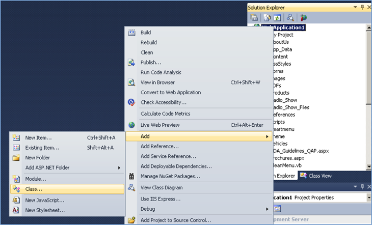
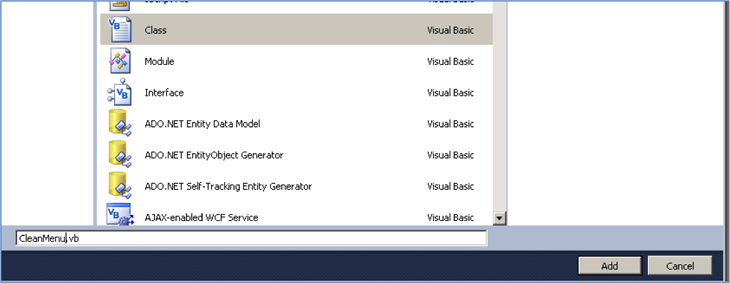
- Create a new class. Name it "CleanMenu.vb". [You can choose your own names, but I would recommend using these names until you are familiar and confident with the method.]
- Open the class you created and paste the following code into the file. First clear out any code that exists in the file and paste the following code block in its entirety.
Imports Microsoft.VisualBasic

Partial Public Class CleanMenu
    Inherits System.Web.UI.MasterPage

    Private SitemapValue As String

    Protected Property CleanMenu() As String
        Get
            Return SitemapValue
        End Get
        Set(value As String)
            SitemapValue = value
        End Set
    End Property

    Public Sub New(ByVal NavgiationListID As String, ByVal NavigationListClass As String)
        SitemapValue = GenerateSitemap(NavgiationListID, NavigationListClass)
    End Sub

    Public Function GetCleanMenu() As String
        Return SitemapValue
    End Function

    Private Function GenerateSitemap(ByVal NavgiationListID As String, ByVal NavigationListClass As String) As String
        Dim sb As New StringBuilder
        ' Examine the RootNode, and navigate the SiteMap relative to it.

        sb.Append("<ul id=""" & NavgiationListID & """ class=""" & NavigationListClass & """>")
        sb.Append("<li><a href=""" & ResolveClientUrl(SiteMap.RootNode.Url) & """>Homepage</a></li>")
        ' What nodes are children of the RootNode?
        If (SiteMap.RootNode.HasChildNodes) Then
            Dim rootNodesChildrenEnumerator As IEnumerator = SiteMap.RootNode.ChildNodes.GetEnumerator()
            Dim node As SiteMapNode
            While (rootNodesChildrenEnumerator.MoveNext())
                node = CType(rootNodesChildrenEnumerator.Current, SiteMapNode)
                If node.Url IsNot Nothing Then
                    sb.Append("<li><a href=""" & ResolveClientUrl(node.Url) & """>" & rootNodesChildrenEnumerator.Current.ToString() & "</a>" & vbCrLf)
                Else
                    sb.Append("<li>" & rootNodesChildrenEnumerator.Current.ToString() & vbCrLf)
                End If

                sb.Append(vbTab & List_Childnodes(CType(rootNodesChildrenEnumerator.Current, SiteMapNode)))
                sb.Append("</li>")
            End While
        End If
        sb.Append("</ul>")
        Return sb.ToString
    End Function

    Private Function List_Childnodes(Current_Node As SiteMapNode) As String
        Dim sb As New StringBuilder

        ' What nodes are children of the function parameter?
        If (Current_Node.HasChildNodes) Then
            Dim childNodesEnumerator As IEnumerator = Current_Node.ChildNodes.GetEnumerator()

            sb.Append(vbTab & "<ul>")
            While (childNodesEnumerator.MoveNext())
                ' Prints the Title of each node.
                Dim node As SiteMapNode = CType(childNodesEnumerator.Current, SiteMapNode)
                sb.Append(vbTab & "<li>")
                sb.Append("<a href=""" & ResolveClientUrl(node.Url) & """>")
                sb.Append(childNodesEnumerator.Current.ToString())
                sb.Append("</a>")
                ' this is how the recursion captures all child nodes
                sb.Append(List_Childnodes(node))
                sb.Append("</li>" & vbCrLf)

            End While
            sb.Append("</ul>" & vbCrLf)
        End If

        Return sb.ToString
    End Function
End Class
Save the class file and close it. - In the
<head>section of your MasterPage, make sure that you have the following script:<script type="text/javascript"> $(function () { $("#NavigationMenu").smartmenus(); }); </script>If you are using a MasterPage, you will find it useful to use this style of src and href definition so that any of your aspx pages not in the same directory as your MasterPage will load the script and link files correctly. Be sure that the URL is correct for your own project.<script src="<%# Page.ResolveURL("~/Scripts/jquery-1.7.0.min.js") %>" type="text/javascript"></script> <link href="<%# Page.ResolveURL("/~Theme/redmond/jquery-ui-1.10.3.custom.min.css") %>" rel="stylesheet" type="text/css" /> <script src="<%# Page.ResolveURL("~/Smartmenu/jquery.smartmenus.min.js") %>" type="text/javascript"></script> <link href="<%# Page.ResolveURL("~/Smartmenu/sm-core-css.css") %>" rel="stylesheet" type="text/css" media="screen" /> <link href="<%# Page.ResolveURL("~/Smartmenu/sm-blue.css") %>" rel="stylesheet" type="text/css" media="screen" /> - In the
<body>section of your MasterPage, paste this where you plan to have your navigation menu. It is assumed that you have your own plan for placement of the navigation menu on your page. If you are not familiar with this tag, the "asp:Literal" tag will "literally" paste the clean, nested, unordered list that the CleanMenu.vb class reads from your sitemap.<nav> <asp:Literal ID="SitemapList" runat="server"></asp:Literal> </nav>
- In your MasterPage CodeBehind (remember, the assumed script language is VB) and paste the following code inside these subs.
Private Sub LoadPage(ByVal sender As Object, ByVal e As System.EventArgs) Handles Me.Load

    ' This makes sure that your script and link files are bound correctly in your aspx pages
    Page.Header.DataBind()

    Dim SitemapMenu = New CleanMenu("NavigationMenu", "sm sm-blue")
    Me.SitemapList.Text = SitemapMenu.GetCleanMenu
End Sub
This is all you should need to do. Rebuild your project and test it out.
Upgrading from 1.0.x
Upgrading vanilla SmartMenus jQuery (used without the Bootstrap addon)
To upgrade from a 1.0.x release first you would need to replace the old JS file "jquery.smartmenus(.min).js" with the new one and the old CSS core file "sm-core-css.css" with the new one.
Then your theme might need slight changes of the .sub-arrow styles since in v1.1.x we have changed these defaults from:
subIndicatorsPos: 'prepend', subIndicatorsText: '+'to:
subIndicatorsPos: 'append', subIndicatorsText: ''
As an example, here is how the default "sm-blue" theme is changed to address this.
Old SCSS:
// Toggle buttons (sub menu indicators)
span.sub-arrow {
  position: absolute;
  top: 50%;
  margin-top: -(ceil($sm-blue__toggle-size / 2));
  left: auto;
  right: $sm-blue__toggle-spacing;
  width: $sm-blue__toggle-size;
  height: $sm-blue__toggle-size;
  overflow: hidden;
  font: bold #{$sm-blue__font-size-small}/#{$sm-blue__toggle-size} monospace !important;
  text-align: center;
  text-shadow: none;
  background: $sm-blue__collapsible-toggle-bg;
  @include border-radius($sm-blue__border-radius-small);
}
// Change + to - on sub menu expand
&.highlighted span.sub-arrow:before {
  display: block;
  content: '-';
}
New SCSS:
// Toggle buttons (sub menu indicators)
.sub-arrow {
  position: absolute;
  top: 50%;
  margin-top: -(ceil($sm-blue__toggle-size / 2));
  left: auto;
  right: $sm-blue__toggle-spacing;
  width: $sm-blue__toggle-size;
  height: $sm-blue__toggle-size;
  overflow: hidden;
  font: bold #{$sm-blue__font-size-small}/#{$sm-blue__toggle-size} monospace !important;
  text-align: center;
  text-shadow: none;
  background: $sm-blue__collapsible-toggle-bg;
  border-radius: $sm-blue__border-radius-small;
}
.sub-arrow::before {
  content: '+';
}
&.highlighted .sub-arrow::before {
  content: '-';
}
Upgrading SmartMenus jQuery + Bootstrap addon
You simply need to replace the old JS and CSS files with the new ones.
Requirements
The script requires and fully supports jQuery 1.7.0+.
If you need 1.4.4+ support, you might use an older release like 1.0.1.